ROC-Kurven vergleichen mit JMP: Teil 1 – Grundlagen & Einzeltest mit Konfidenzband
Schlagwörter: ROC-Kurve, Sensitivität, Spezifität, AUC, Vorhersagemodelle, Cutoff-Wert, JMP Software, medizinische Statistik
Einführung: Was ist eine ROC-Kurve?
ROC-Kurven (Receiver Operating Characteristic) sind ein zentrales Werkzeug zur Bewertung von Klassifikationsmodellen, insbesondere in Bezug auf Sensitivität (True Positive Rate) und Spezifität (1 – False Positive Rate).
Vor einiger Zeit entwickelte mein Kollege Prof. Dr. Dr. David Meintrup ein hilfreiches Skript zur Analyse und zum Vergleich von ROC-Kurven in JMP. Mit diesem Add-In können Sie nicht nur eine einzelne ROC-Kurve mit Konfidenzbändern erzeugen, sondern auch mehrere Tests vergleichen.
Blog-Reihe in drei Teilen:
-
Teil 1: Grundlagen & ROC-Kurve mit Konfidenzband für einen Test
-
Teil 2: Den optimalen Cutoff-Wert identifizieren
-
Teil 3: Vergleich mehrerer Tests & partielle AUC (pAUC)
📚 Falls Sie neu in das Thema einsteigen: Eine gute Einführung finden Sie z. B. unter Introduction to ROC Analysis.
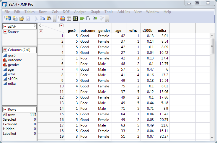
Beispiel-Datensatz: aSAH aus dem R-Paket „pROC“
Zur Veranschaulichung nutzen wir den aSAH-Datensatz (aneurysmatische Subarachnoidalblutung) mit 113 Patienten. Ziel: Ein klinischer Test, der zuverlässig den Outcome (Prognose) eines Patienten vorhersagt. Ein schlechter Ausgang erfordert meist intensivere medizinische Versorgung [1].
Drei Tests stehen zur Auswahl:
-
wfns
-
s100b
-
ndka
Fragestellung: Welcher Test ist am besten geeignet, um Patienten mit schlechter Prognose zu erkennen?
Ein „guter Test“ erfüllt zwei Kriterien:
-
Hohe Sensitivität: erkennt zuverlässig Patienten mit schlechtem Ausgang
-
Niedrige Falsch-Positiv-Rate: klassifiziert möglichst keine gesunden Patienten falsch
Eine ROC-Kurve zeigt das Zusammenspiel von Sensitivität und Falsch-Positiv-Rate in einem einzigen Diagramm – ideal zur Bewertung und zum Vergleich diagnostischer Tests.
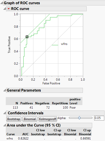
Anwendung: ROC-Kurve für „wfns“ in JMP erstellen
Starten Sie das JMP-Skript. Ein Dialogfenster erscheint:
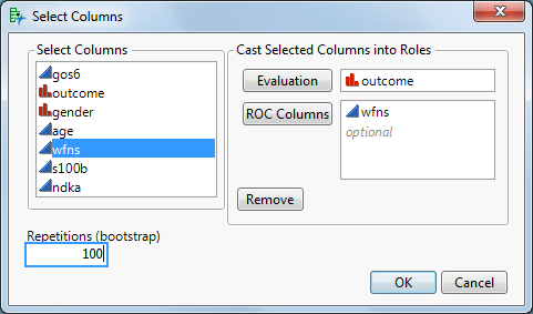
Evaluation-Spalte: enthält das Ziel (Outcome), z. B. „Gut“ vs. „Schlecht“
-
ROC-Spalten: mindestens ein Test, z. B. wfns
(Hinweis: Bei Vorhersagemodellen wie Logistische Regression, Random Forest etc. hier die vorhergesagten Wahrscheinlichkeiten verwenden.)
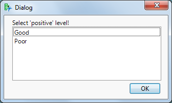
Nach Klick auf OK folgt ein zweites Dialogfeld: Dort geben Sie an, welcher Wert als „positiv“ gelten soll – in unserem Fall „Poor“ (schlechter Outcome).
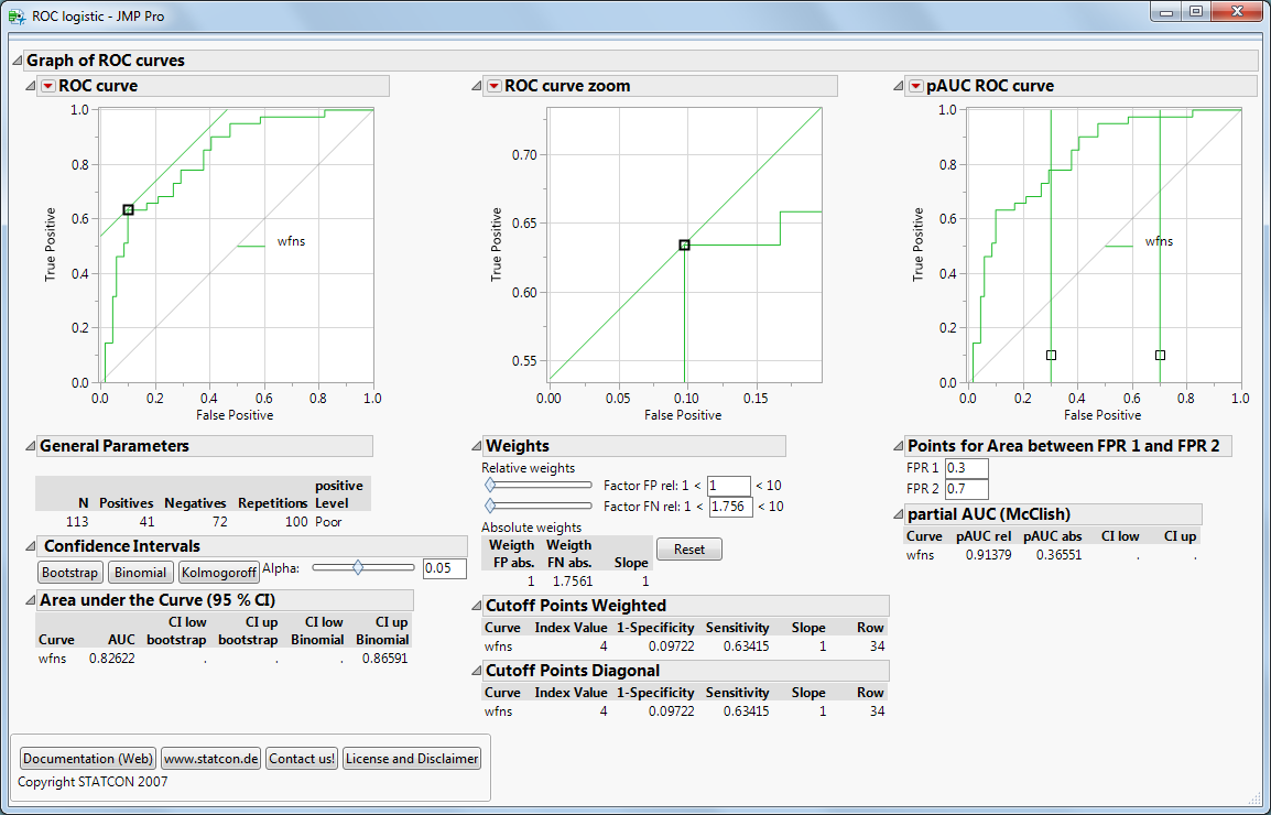
Interpretation: AUC & Konfidenzbänder
-
Die AUC (Area Under the Curve) beträgt 82 % – ein guter Wert, abhängig vom Anwendungsfall.
-
Eine perfekte Vorhersage hätte AUC = 1.0.
-
Die AUC eignet sich besonders gut zum Vergleich mehrerer Tests.
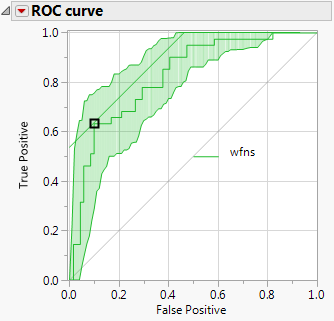
Jetzt auf „Bootstrap“ klicken!
JMP erstellt grüne Konfidenzbänder um die ROC-Kurve. Diese zeigen, wie stabil und verlässlich der Test ist.
-
Ist die ROC-Kurve deutlich über der Diagonale (Zufallsmodell), ist der Test gut.
-
In unserem Fall liegt die Diagonale außerhalb der Konfidenzbänder – ein starkes Signal.
Warum sind die Bänder nicht symmetrisch? Wir verwenden hier Bootstrap-Konfidenzbänder. Alternativ gibt es binomiale oder Kolmogorov-Bänder (klassisch symmetrisch).
Ausblick: Cutoff-Wert & Testvergleich
Im nächsten Blogbeitrag gehen wir auf die Auswahl des optimalen Cutoffs ein. Danach zeigen wir, wie Sie mehrere Tests mithilfe von ROC-Kurven und partiellen AUCs (pAUC) vergleichen können.
Literatur & Ressourcen
-
X. Robin et al.: pROC: An open-source package for R and S+ to analyze and compare ROC curves
-
M. Müller et al.: ROC-Analyse in der medizinischen Diagnostik
-
JMP 12 Dokumentation